
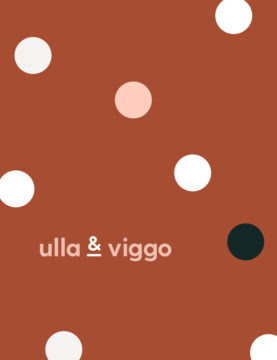
Brand Collateral, Brand Identity, Logo Design
Brand Collateral + Brand Identity
Brand Collateral, Brand Identity, Logo Design
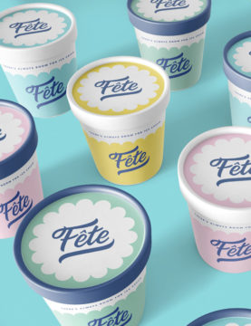
Brand Identity, Logo Design, Packaging Design
Brand Collateral, Brand Strategy, Photography, Social Media
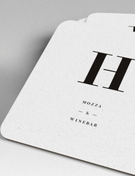
Brand Collateral, Brand Identity, Exterior Signage, Packaging Design

Marketing Strategy, Photography, Art Direction

Brand Collateral, Brand Identity, Packaging Design
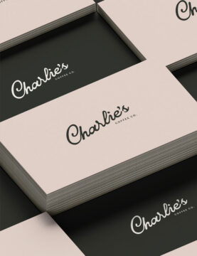
Brand Identity + Brand Collateral

Website Design, Packaging, Illustration

Brand Identity + Website Design
Brand Identity + Brand Collateral